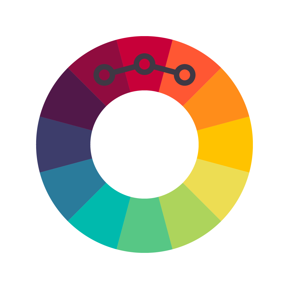
Choosing the right colors for your Spin Wheel Email Pop-Up is important to create an appealing and cohesive look for your website. Here are some tips to help you choose the right colors:
- Consider your brand’s color scheme: Your pop-up should reflect your brand’s color scheme and overall aesthetic. Choose colors that match or complement your brand’s color palette.
- Use contrasting colors: Using contrasting colors for different elements of the pop-up can make it more visually appealing. For example, you could use a light color for the background and a dark color for the text or wheel segments.
- Consider the psychology of color: Different colors evoke different emotions and can impact the way visitors perceive the pop-up. For example, blue is associated with calmness and trust, while red is associated with excitement and urgency.
- Test different color combinations: Before making a final decision, try testing different color combinations to see what works best. You can use tools such as heat maps to see how visitors are interacting with the pop-up and make changes based on the results.
Remember, the Spin Wheel Email Pop-Up is a representation of your brand, and the colors you choose can have a significant impact on its success. Take the time to carefully consider the colors you choose to ensure that the pop-up is visually appealing and effectively captures the attention of your visitors.
Leave a Reply